I wish I was artistic, I like to think I’m creative and have a good eye for design and colour, but I can’t draw for toffee and struggle in the execution of the masterpiece ideas I visualise in my head.
I bring you fellow non-artists five blog photo design tips — disclaimer — I am no expert but I have spent a month messing about with some failures but some successes too – just see this as something to get you thinking!
-
Inspiration
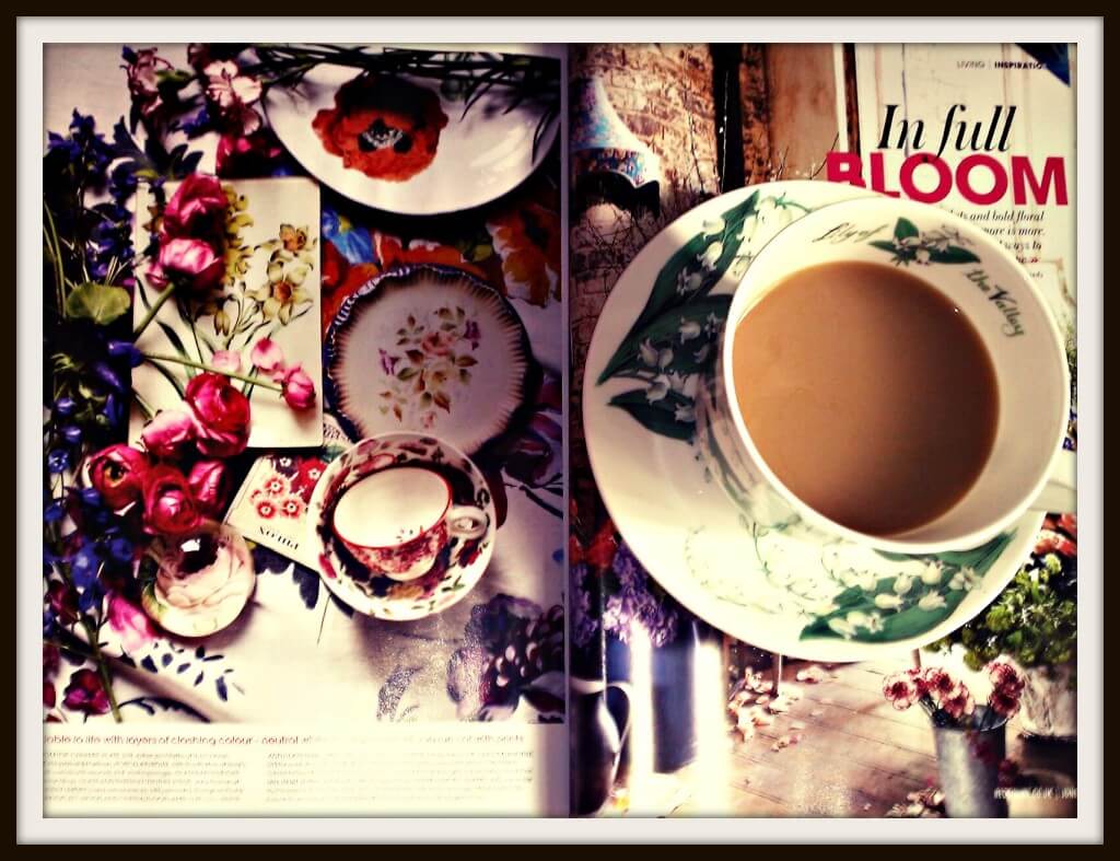
Take inspiration from setups that you really like. I absolutely adore flowers and this Red Magazine floral splash really caught my eye. Lots of rich colours, carefully chosen textures and playful shapes! This is my What’s The Story photo for this week, as I can’t stop looking at these two pages of this magazine!
-
Design cheats
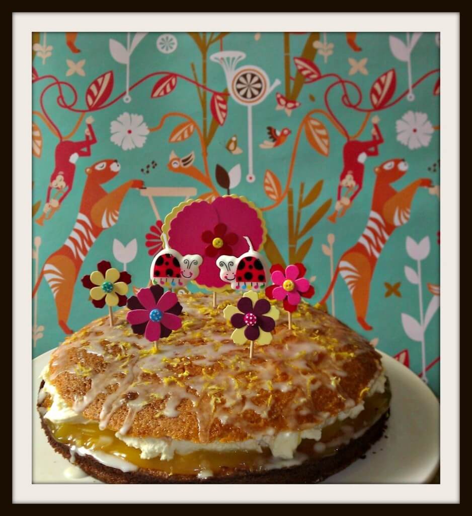
So this is what you see…gosh doesn’t Ang have some cool wallpaper?!
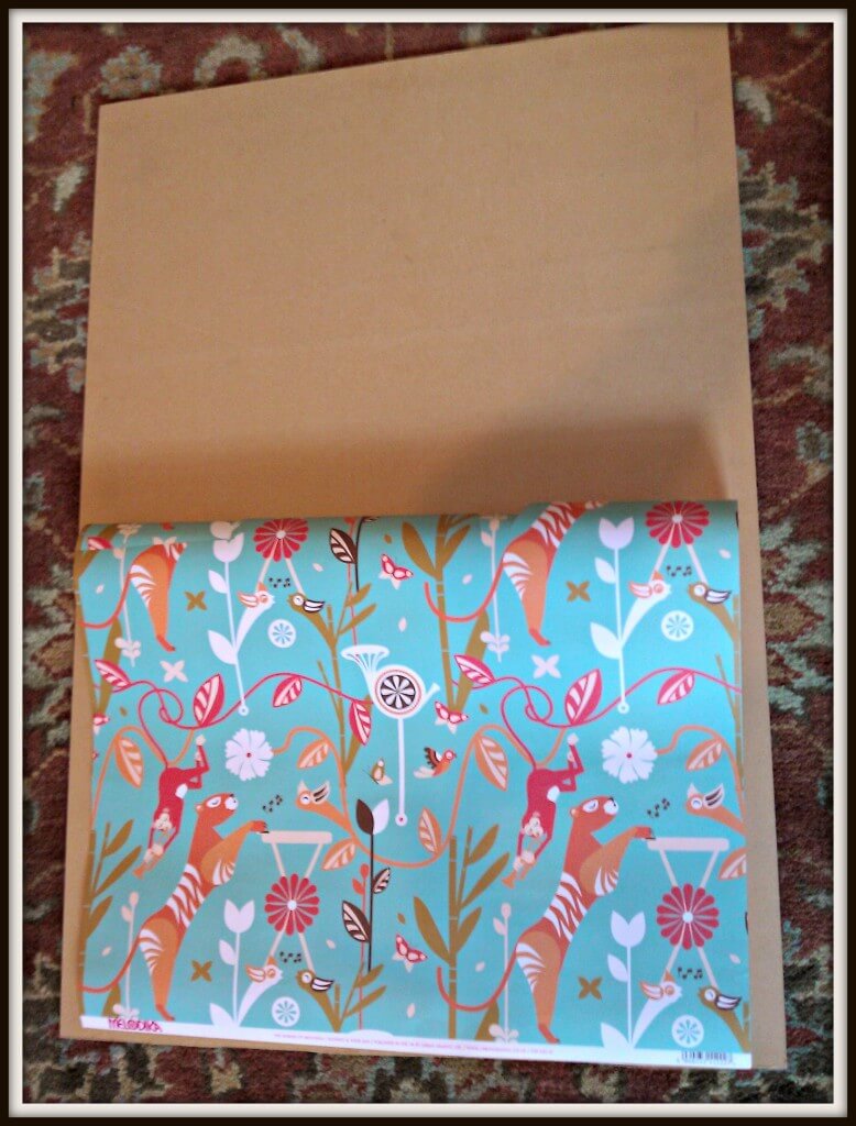
…and what you don’t see! Just a big old piece of plywood and some cheap wrapping paper!
-
Colour
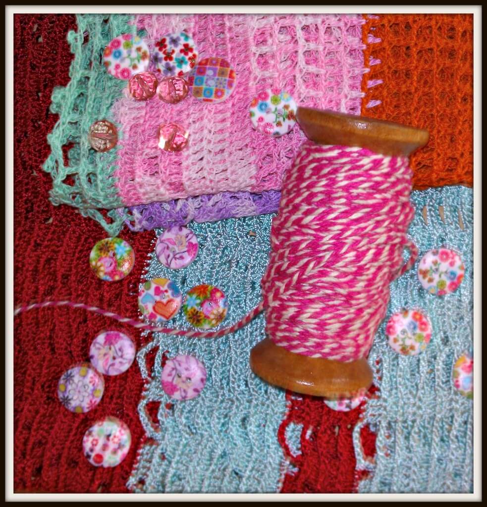
Create mood boards to experiment with colours, textures, backdrops and more, see how clashing colours work, pile stuff together, break them up, having that big bit of plywood helps as a base!
-
Themes
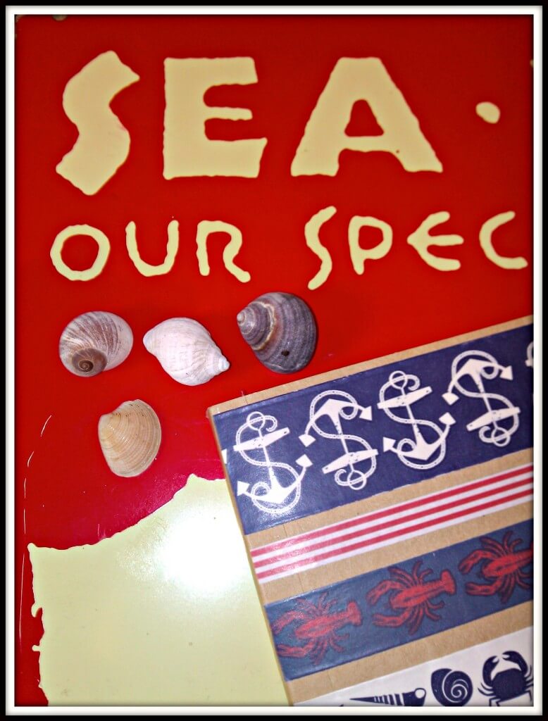
I love a nautical theme and it often creeps into my craft, I like to use props that reflect this theme, and we’ve a lot of beachy stuff around the house!
Look out for small bits and bobs from nature to add interest to your photos, like this little whale eraser that cost me a quid and often crops up in photos!
-
Props
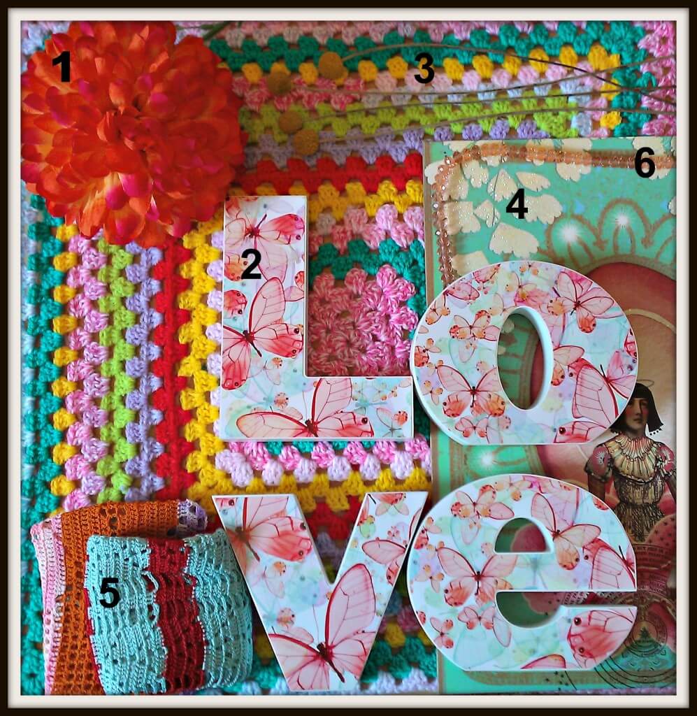
Props can be anything, stuff you have around the house repurposed to add interest to your shots. Mix textures, colours, shapes and shade, here’s a selection that I use:
1) Huge fabric flower 2) LOVE lettering from our master bedroom 3) Dried craspedia heads 4) A noticeboard 5) Crochet cloths to add colour and texture just a quid each on Ebay 6) A string of vintage beads
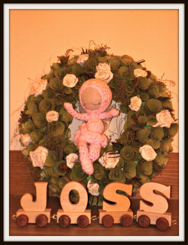
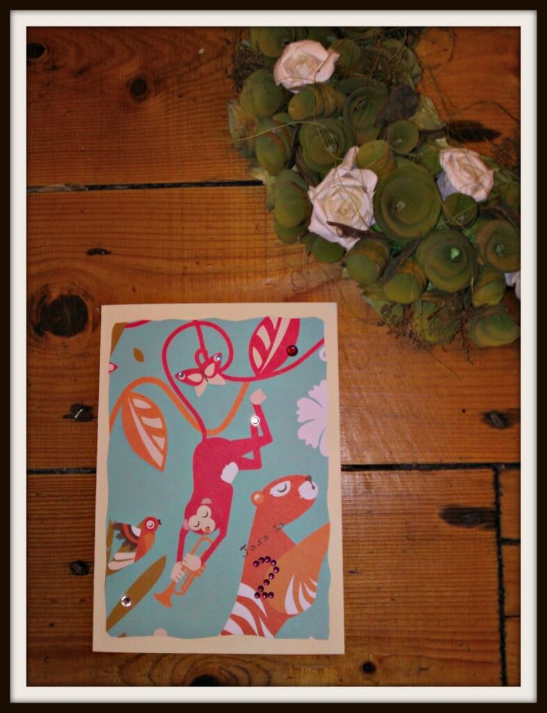
This is a little setup in Joss’ room
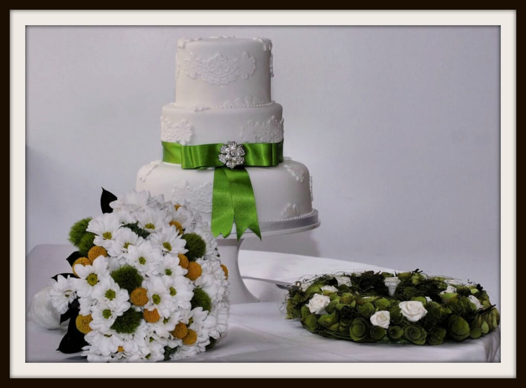
And that wreath from our wedding day…
Frequently crops up in blog pics!
And finally, take your lead from the experts, check out magazines that you like and blogs that you like, and really look at their styling!






Chantelle this is AN AMAZING post. Thanks for all the tips. I am just learning to get more creative with my post and start using props and thinking outside the box a little more as all my photos are really simple and boring. This has helped give me some more ideas. Thank you!!! #whatsthestory
Please excuse my calling you chantelle trying to tweet to my friend chantelle and comment on your amazing post. hahaha Sorry!!!
Helpful. I am actually doing an entry to a cooking challenge and I want my photos to look yummy! Got some tips from here! Will do the wedding cake set up.. like the dish will be the center but will put some stuff around. it is still in my head so I dont know how it will turn out =) #whatsthestory
Some excellent ideas here, the one I particularly love is the cheap wrapping paper pretending to be wall paper, genius!
Thanks for some great tips. I am striving to improve my photography but I don’t have the eye to get it quite right #whatsthestory
Thank you for sharing some staging tips, I am useless at creating a scene and really need to give it much more consideration
Fantastic ideas! I have started to experiment more with my pictures and I really enjoy it
Also light is everything! I try and take my images with natural daylight when and where possible
Some great tips! It is something I am trying to improve on too!
Thank you for sharing such fab tips! I am rubbish at staging- would never have thought people use wrapping paper! Will definitely be trying out a few of these!
Great tips!! I’m definitely going to get some cool wrapping paper for different backgrounds.
A post full of inspiration and ideas. I’m pinning this. Thank you.
The wrapping paper background is a great tip
What a great post Ang, so many useful tips in there. I must improve my styling, I don’t get the time to tinker with it but I’d love to! Great post, thank you for sharing #whatsthestory